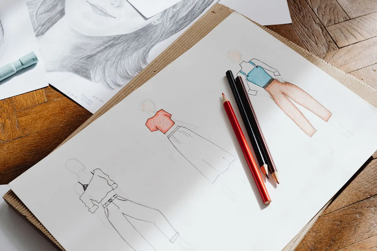
Twelve spreads, twelve ways of standing still. Some were made in twenty minutes on a harbour wall while the wind tried to lift the paper; others took an hour from a folding stool on a moorland track, a flask of tea going cold in the grass. What they share is a lack of pretence. None of these pages is finished in the studio sense, and that is exactly what makes them worth studying.
What follows is a tour of the sorts of spreads that recur in British outdoor sketchbooks — coastal, urban, upland — with notes on how each one is put together and what you might borrow for your own book this weekend.
What makes a spread worth a second look
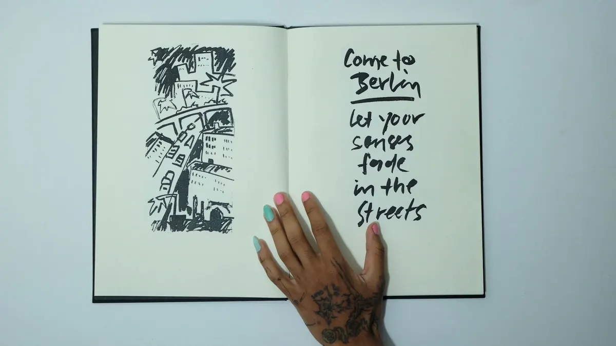
A spread is not two pages that happen to be joined. It is one rectangle with a fold down the middle, and the fold is a hinge rather than an obstacle. The strongest books tend to keep one main idea on the left and a smaller, quieter note on the right: a wide harbour view beside a thumbnail of a mooring cleat, a street scene beside three rapid studies of a passing coat.
Draw across the gutter only when the subject genuinely spans it — a long horizon, a seawall, a terrace of houses that runs the full width of the book. Otherwise let the fold do its job and separate two thoughts cleanly.
Four things turn up in almost every spread that works:
- One clear focal point, off-centre. Rarely in the middle of either page.
- Two or three tones rather than twenty. Restraint reads as confidence.
- Somewhere for the eye to rest. Bare paper counts as a colour.
- A note in the margin: place, time, weather, and what you would do differently.
Coastal and harbour spreads
The coast is generous to sketchers. Water arrives as one large shape, boats as a handful of simple ones, and the light changes fast enough to keep you awake. That speed is also the trap: try to record every ripple and the page turns to mud.
Three washes and a wet edge
The best harbour spreads in this batch use watercolour sparingly. A pale wash for the sky, a middle tone for the far shore, a darker one for the near water. Wet sand reflects more than it absorbs, so leave the brightest strip of paper untouched and let it stand in for the sheen. Work each wash once and stop. Scrubbing at half-dry paper is what makes a sketch look tired.
Boats as shapes, not objects
Ignore the rigging until the very end. Block the hull as a wedge, add the cabin as a box, then place two or three lines for ropes and masts. If the boat sits at an angle, check the angle against the edge of the page rather than against your memory of boats.
City and street spreads
Urban spreads fail for one reason: the artist tries to draw everything before it moves. The pages that succeed treat the street as a stage set, then drop figures onto it in the last few minutes. Backgrounds get drawn carefully, people get drawn quickly, and the two speeds sit together convincingly.
A reliable sequence for a busy street spread:
- Sit down and do nothing for five minutes. Watch which shapes repeat.
- Block the largest shapes first — road, pavement, facade, awning.
- Add one mid-tone to separate the ground from the buildings.
- Draw figures last, as silhouettes. Ten seconds each, no faces required.
- Stop while the page still has air in it.
Some artists keep a left-hand page for a row of six thumbnails of the same corner at different times of day. It reads as a comic strip, and it teaches more about light than a single finished drawing ever will.
Moorland, weather and grey light
Upland spreads are usually the quietest in a sketchbook and often the most useful. British weather gives you a narrow, silvery range of greens, greys and browns, and there is little point fighting it with strong colour. Instead, look for the shape of a cloud shadow crossing a hillside, or the dark line of a drystone wall against bleached grass.
Wind is the practical problem. Keep the kit small enough to hold down with one hand:
- A hardback book, roughly A5, with an elastic closure.
- One waterproof fineliner and one 2B pencil.
- A small tin of six colours, or a water brush and a travelling palette.
- A bulldog clip to stop pages flapping.
- A cloth for drying the page and your hands.
If the rain arrives, keep going for another two minutes. Damp paper takes pencil differently and some of the best marks in these spreads were made in a hurry.
Notes in the margin
Half the value of a plein air spread is written rather than drawn. Dates, times, tide states, wind direction, the name of the pub you were sitting outside — all of it feeds back into the work later. A note that says “cold, low sun behind me, wall too dark” will save you an hour of guessing in the studio.
Write on the page while you are still there. Memory tidies a place up within a day.
Keep the writing small and in one corner, so it reads as part of the composition rather than an apology for it.
From sketchbook to studio
Spreads like these are not only warm-up exercises. They are reference. When a larger painting goes wrong, the sketchbook usually explains why: the tonal pattern was never clear in the first place, or the composition was borrowed from a photograph with no real point of view.
Use two or three spreads together rather than copying one. Take the shape of the sky from Monday, the wall from Saturday, the colour of the water from the day you got soaked. That is how a sketchbook becomes a place you know rather than a set of pictures you made.
Try one of these spread ideas this week
Pick a single subject you can reach on foot and give it forty minutes. Choose something with a strong silhouette — a bridge, a shed, a pair of moored dinghies — because silhouette is the easiest thing to read when you are working fast and the hardest thing to fake later.
Work across two pages, keep to three tones, and write your notes before you pack up. Try not to judge the result until the next morning; outdoor sketches often look better after a night's sleep, when you have forgotten what you meant to draw and can see what you actually drew. Do the same subject again a fortnight later in different weather, and compare the two spreads side by side. That comparison, more than any single finished drawing, is where the improvement shows up.
Photo: Skylar Kang / Pexels